Wednesday, 26 September 2012

Ceramic Towers


The aim of this project was to explore and recognise the potential of working with clay by learning through experimentation. We were split into pairs and then we made groups of 6 (3 sets of pairs). Each pair was responsible for either the base, the middle or the top section of the tower - my pair and I were responsible for the base.

We had a lot of clay to work with and a lot of tools for making patterns, as well as coloured slip and grog. There were also oxides but there wasn't time for our group to have the oxide presentation so we didn't use them.

To start off the project we did some minor planning. As a team we decided to do our own thing with each section so that when we joined it up we would have a mish-mash of different textures and patterns together. After some initial planning with my pair, we decided to have a cube base and then as a group we decided to each follow a shape as a guideline, to provide some consistency to the tower. In addition to the base being a cube, the middle section was triangular and the top section was circular.

My pair and I started by cutting squares out of clay to construct the base cube. We used masking tape to make a square stencil on the clay and then coloured over it with coloured slip, to give a square pattern. We also tried using a plastic stencil with circles in it to add a circle-pattern but this was less successful as the slip went under the stencil and went quite messy. On the other squares we just used simple textures, such as a bumpy pattern which was did with a ridged-roller.

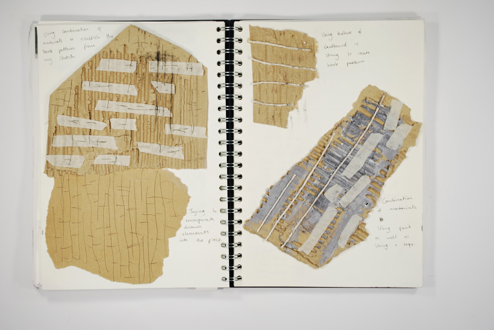
This is part of my sketchbook, showing some of the minor planning as well as some of the experimentation with the coloured slip and masking tape.
After the first of the two days we had for this project we found that the base cube we'd constructed was simply not working. It was very thin and brittle and wasn't sturdy enough to be the base, so on the second day we decided to start again, using thicker, bigger slabs of clay to construct the cube and by using small pieces of clay on the inside edges to join it together. The second cube was much more successful and was much stronger. We also decided to make our base out of 3 cubes on top of each other, getting smaller in size, which we felt was necessary after seeing the size of the other pairs' middle and top section, to fit everything together.

This was our first cube, which is clearly quite small, with thin sides - one of the sides even has a tear in it. The unsuccessful circle-pattern can also be seen which we decided not to use on our second cube.

This is our second, more successful attempt. We kept the squares that we made with masking tape and we used simple textures on the other sides to provide a cleaner, more organised, confident appearance.

To construct our base, we first rolled out the big logs of clay. We tried flattening the clay with our feet and then used our feet to roll the clay out. When the clay was thinner and more manageable, we used our hands to roll it out.

Me rolling the clay out with my foot

To construct the cube, we used plastic tubes to act like scaffolding - it provided the sides of the cube with some stability while we joined it all together. We scored the sides with a knife and then applied slip to stick it together. We then smoothed the edges on the top and outside together. On the inside we pressed small strips of clay into the edges and smoothed that out.

Constructing one of our base cubes using the plastic tube


We used a variety of different textures for our cube, loosely following an industrial/natural theme that my pair and I adopted. We used the geometric square shape, an imprint from a metal door and ridged/patterned rolling pins to act as 'industrial' patterns. We used leaf imprints, bark imprints and grog to act as 'natural' patterns.

Our finished base, made up of 3 cubes. To join the cubes together we cut ridges into them so that they'd sit on top. of each other. We then smoothed the insides to make it stronger and join it together as one piece.

 To help me with this project I researched four artists; Jenny Beaven, Hans Coper, Gordon Baldwin and Paul Soldner. It was Beaven's and Baldwin's work that particularly appealed to me, with Beaven representing a 'moment' through several layers of texture and Baldwin deconstructing simple shapes into more interesting, abstract forms.

Some of my artist research from my sketchbook

Unfortunately we didn't have enough time to fully construct our tower as we had to re-do our base and it was still very wet and soft by the end of the day. I evaluated this project and I said that timing was an issue for my pair and I - our poorly planned first attempt at the base cube meant we had to spend all of the second day doing 2 days-worth of work. At least we constructed our base and I'm sure it would be quite simple to attach the base to the middle/top section.

The middle and top section joined together. The middle followed a triangular design, while the top was following a circular one. This should sit on top of our base - the small size of this section is the reason we decided to have 3 cubes gradually getting smaller - so it would all fit together. 


Life drawing


For one college week (4 days) we did life drawing, something I'd never tried before.

We were given a handout telling us how to fit the figure on the page using the simple straight arm method of measuring; I was aware of measuring with a pencil but I'd never really done it before. Using the pencil and my thumb I held my arm out straight and counted the amount of 'heads' there were in the body. I then transferred this amount to paper, deciding how big I wanted the image to be and then dividing that space into however many heads I counted.

I then continued to use my measuring with the pencil and my thumb to see exactly what part of the body fitted into which section I'd divided up on my page. I found this process really useful but in order for it to be effective I had to stand in the same place, so that my measurements would always be the same - this was something I found difficult but it wasn't a huge problem.


This was my first drawing with a 3B pencil - all the pencil drawings were 3B


I found this drawing quite difficult, as the chair was really challenging to include. I think from the waist downwards everything is too big and curvy.

I tried to be more conscious of the quality of line I was making with this drawing; I tried to use lighter lines throughout and use darker, more confident lines for areas where there was more shadow. This pose was chosen specifically to get us to use the foreshortening technique but my position in the room didn't allow much of this. However, with the arm and leg on the left there is some slight foreshortening which I didn't find too challenging to do.


This is a charcoal drawing, first sketched out lightly in pencil. I'd never really used charcoal before but I was advised to think of the different shades of light/dark in 5 categories (very dark, dark, medium, light, very light) and this helped. The subject's pose was more challenging for me as he was leaning back slightly and should therefore have appeared slightly slanted - I tried to include a plinth in the background which was straight, so that any leaning of the subject would be emphasised but it still didn't really work. Ultimately though this was a tonal exercise and I think it went well.


This drawing and the next one down are my favourite two. We started by using masking tape to create a rectangle on the page and then filled the entire square with smudged charcoal, making sure to only put down a light layer so that we could erase it to include light areas. I used charcoal to draw, instead of using pencil, and then concentrated on the light and dark areas, using the charcoal and an eraser to do this by pressing lighter and harder depending on the tone I wanted. This was the first drawing where I paid attention to the background and it definitely made a huge difference; for example, it helped me when choosing the right tone for the body when I had the dark curtain and the light wall in the background to use as a reference. When the drawing was finished I removed the masking tape border which made the drawing look really neat.

Like the drawing above, I really like this one. It was the first drawing I did where the whole body wasn't required to fit on the page, instead being told to concentrate just on the head and torso. Again, we used masking tape to make a rectangle and then filled the space with smudged charcoal. Working with a bigger body, I felt more confident with my lines but this often made them very dark and messy which I later needed to clean up. The background was distinctly split into a dark area and a light area so the mid-tone body really stands out. I was more subtly with my erasing in this drawing, trying to get a wider range of tones.

After splitting the page into 8 sections, we had about 15-20 minutes to draw using different techniques. The model changed poses for every drawing. The first two drawings were simple sketches using a biro - the inclusion of the chair was something I found really difficult and I had trouble fitting it in accurately with the body, particularly with the legs (as the first drawing shows). The third drawing was done with black ink and matchsticks which I really liked; the matchsticks allowed the lines to be a little more clumsy and scratchy. The fourth drawing was with twigs and ink which basically the same as the matchsticks but just a little more uncontrollable. The fifth and final drawing was with matchsticks and ink but was about building up the image through crosshatching.

We split the page into 8 sections, like before, and used a more experimental method of mark-making for each section, again just for 15-20 minutes. The first section was a close-up of any part of the body using matchsticks and ink - I did a close-up of the arm. The next was a painted tonal piece with acrylic paint, again of a close-up part of the body - I did the foot. I find acrylic paint really difficult to work with and I think this shows in the picture - it looks really messy and  bulky. The other 4 squares were about experimenting with the ink and small chunks of wax; it was difficult to see the lines you were making with the wax so it was rarely anatomically correct. The top two experiments with wax are quite basic and juvenile but the bottom two, I think, are more adventurous; I carefully drew out the figure in wax and then experimented with how to put the ink on. I tried dribbling it down and I tried a striped pattern and I'm pleased with how it only reveals part of the image, instead of all of it in a big black square. The face on the right was drawn out with wax and I then tried to water the ink down to achieve areas of light/dark.


Friday, 7 September 2012

Photography and Photoshop

Continuing on from our induction, we moved onto the photography side of Photoshop.

After being told about the Rule of Thirds we were split into pairs and given guidelines of which photos to take, for example 'take a photo with some trees' or 'take a photo where the subject is running'.

I took 76 photos with my Nikon D60 camera and transferred them to the Mac where I then made a contact sheet.

After this I started to use Photoshop to crop the images, viewing them on a black background and using the Rule of Thirds to try and create a more interesting photograph. I edited the photos on Photoshop, adjusting the brightness, contrast and saturation of some of the images as well as being less subtle with others, playing around with the curves and levels of colour.

Below are the images I edited on Photoshop which I consider to be the best few out of all the photos I took.

I increased the contrast on this photo to make it a bit more vibrant. I didn't want to do too much to it and only cropped it a little bit at the bottom and the sides. It was taken when I got my subject to walk towards me down a corridor.

This photo was taken under a bridge. It required some rotation as the original photo was slightly wonky.  I didn't crop it too much as the large, dark space really adds a lot to the photo, making the subject seem very distant. 

I increased the contrast on this photo to make the colours a little more vibrant which works especially well with all the greens of the trees. I tried to use the Rule of Thirds with this photo by placing the subject slightly off centre but I think this positioning with the subject in the middle is much more effective, particularly as the trees on either side seem to 'frame' the image.

I cropped this photo to place the subject slightly more to the right and to also cut out the bins in the background on the left. I lowered the vibrancy in Photoshop and then increased the contrast which gives these dull yet strong colours. I think this suits the emptiness of the background and the sullen expression of the subject.

I cropped this photo to, again, place the subject slightly more to the right. I think this works well, with the pillar on the left balancing this out. I changed the photo to black and white which I think gives an intense emptiness to the photo.

With this photo, I played around with the colour balance and the curves of the image.  I then increased the brightness and lowered the saturation to achieve an old-photograph feeling.

This photo had a lot of light in the background and the subject in the dark. I altered the saturation so the bright, vibrant orange of the wood in the background changed colour. It looks really surreal and I think the brightness of the colours in the background with the silhouette of the subject in the foreground works really well.
I tried again with this photo, altering the
curves in a different way and trying to achieve
a softer effect. I also increased the brightness
quite a lot which adds to this effect as well
as adding a little more life and vibrancy
to the photo.
With this photo I altered the curves in a certain
way to try and give it a retro appearance.
I don't really like this one though - I think
it looks a bit too dark and dull and sucks
a lot of the life out of the photo.


I cropped this photo to remove the rest of the subject's head which I think works well as it makes the photo seem more intimate with only part of the head showing. The blurred background ensures that all of the focus is on the subject too. I altered the curves of this photo in Photoshop to give a more earthy, toned-down feel to the colours. I then increased the contrast to highlight this and to make everything a little more vibrant.

The original photo was quite wonky so I rotated it slightly in Photoshop. Unfortunately, when rotating I cut off part of the subject's foot which I dislike as it feels like part of the photo is missing. In Photoshop I considerably increased the vibrancy and contrast and decreased the saturation. This gives the photo quite a light, neutral feel which works well with the softness of the light from the window in the background.


Mac & Photoshop Induction

Having never used an Apple Mac or Photoshop before, I found this induction week invaluable.

We started by editing some photos on Photoshop, changing the colour of someone's eyes or lips and cutting a figure out from one image and placing it into another image. After we became familiar with the basics of Photoshop we were split up into pairs to produce a B-Movie poster for a fictional film plot given to us. The film given to me and my pair was "Professor Spinebender's Land of the Hybrid Hunters", where the plot was a mad scientist turning people into human/animal hybrids.

My role in the pair was to create the human/animal hybrids, while the layout of the poster was left to my partner. This is what we created:

The finished B-Movie poster

I'm happy with how this poster turned out, especially considering we had only just been introduced to Photoshop. We intentionally chose very bright colours to try and replicate the feel of the old B-movie posters we had as examples.

The next task was to create a mixed media image for a website that represents us as artists. I used images I'd previously created - paintings, drawings and photographs - to build up a collage-like composition on Photoshop. I used the scanner to add a drawing I drew specifically for the image of a small figure holding a sketchbook with pages flying out. I also drew my name on paper and then scanned it in.


My finished piece containing my own photos, drawings and paintings

I like this image. I think that the chaotic, collage-like quality to it was necessary to incorporate all my own work which had a variety of different styles, being from both A Level work and my own doodles.


Constructed Drawing


The first project I undertook on Foundation Art & Design was the constructed drawing project. The aim of the project was to become familiar with using materials in both conventional and non-conventional ways and to challenge our perception of drawing. We used cardboard, tape, black and white paint and string, as well as other materials, to construct a piece in 3D or low-relief inspired by our initial drawings from the embankment.


To start this project, we went to the embankment in Bedford to take sketches of the area, focussing more on how the landscape was constructed in terms of composition, perspective and tone rather than sketching out perfect trees etc. 

Two pages of my initial drawings from the embankment

I made drawings of individual objects, such as a bin, a section of railings or a particular tree, as well as choosing more varied sections of the landscape in general. I made sure to record depth and perspective in my drawings by making heavy, darker lines to show when an object was in front of another and sharper lines for lighter or more detailed areas. I had four pages of these drawings before starting my constructed piece.

I also took photos of the areas I drew for further compositional reference.


One of my photos

When starting our constructed pieces we had a choice of a small, medium or large piece of cardboard to use as a starting point; I chose the largest so I had more room to work with when constructing. This proved to be a good decision as after thinking about the piece for a long time I decided to get right into it and started ripping sections of the cardboard off - after ripping bits off I still had a large area to work with.

After ripping into it I could start to see a tree-like shape forming so I used this as a starting point for my plan, trying to incorporate a specific tree I drew which had an interesting twisted shape which highlighted light and dark areas. When planning, I found there were certain parts of my drawings that I thought would work well with the piece so I tried to add them into the composition too, whether it was a certain shape or a certain texture.

I was unsure where to start with my constructed piece so I tried to create light and dark areas, like the 'twisty' tree I drew, with paper, after briefly experimenting with it in my sketchbook. This was unsuccessful so I took it off. After this, I became more thorough with trying things out in my sketchbook before using it on my constructed piece, as shown in the photo below.

My experimentation of trying to achieve a bark-pattern from a tree I drew

After tearing into my piece again I started to become more focussed and confident on what I was constructing, again being guided by small, rough plans I made in my sketchbook, as well as by the artist research I did. I researched Frank Auerbach, Jean-Michel Basquiat, Claude Heath and John Virtue. I wanted to build up layers to achieve a sense of low-relief as well as playing with perspective through the incorporation of a railings-inspired section.

Part of my artist research

 My piece became three different sections; the middle section was taken from a tree I drew, with masking-tape and string used to create its distinctive bark-pattern, as well as watered-down black and white acrylic paint, a fine-liner pen and black paper. The building up of 'messy' layers to try and create and 'find' a certain texture was something I could relate to Auerbach and Heath.

The 'middle' section of my piece

The section to the left of the middle piece was the 'twisty' tree that I had initial wanted my piece to be centred around. After trying to use paper on the cardboard to create its light and dark twists, I instead decided to construct it separately out of white cardboard and brown cardboard, with black paper also used for darker areas. I then attached this to the middle section. The strips of cardboard used for this section worked really well with building up layers and the use of the lighter strips on the darker strips is reminiscent of Virtue's paintings.

The 'left' section of my piece

The section to the right of the middle was where I introduced a sense of perspective; after trying and failing to construct the railings I drew, I instead decided to simply have a railings-inspired line of cardboard covered in black paper, which would get thinner as it went away. As this took the eye away from the rest of the piece, I added another strip to return to the work. This section gives the impression of distance. 

The 'right' section of my piece

 As my piece appeared to be split up into three different sections, I looked to Basquiat's work to try and provide some continuity which he manages in his chaotic compositions. In his piece 'Untitled (Skull)', he uses a stitching pattern to keep different sections together so I tried to replicate this with string. It's a subtle addition that I think works well.

Towards the end of constructing my piece, I decided to add scrunched up balls of cardboard to act as leaves on the middle tree, as I didn't feel that I had made the most of experimenting with the cardboard itself.

The string 'stitching'
The scrunched up cardboard 'leaves'


Once finished, I arranged my piece on the wall so that the 'left' and 'right' sections would stick out slightly, creating a slightly curved piece. Below is my finished, constructed piece.

My finished construction


My constructed piece from the side


I think the strengths of the piece are the use of perspective with the 'railings', as well as the building of layers throughout my piece. I think the weaknesses of the piece are the lack of overt 3D sections and if I could do this project again I would try to be more adventurous with the materials, instead of just trying to mimic certain textures or patterns. However, I'll go away from this project with more confidence with larger pieces, getting right into it, as I did by initially ripping into the cardboard and not being too scared by it.